This is a public forum, where you can find out everything you wanted to know about making games. Please don't use this forum as a place to recruit new members.
Moderators: adeyke, VampD3, eriqchang, Angelus3K
-
CaptainM
- Peasant Status
- Posts: 27
- Joined: Fri Jul 04, 2008 5:56 pm
#1
Post
by CaptainM » Sat Jul 05, 2008 8:30 pm
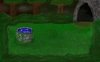
Hey everyone. I'm trying to make a sierra style game. I have only two screens of background art done so far, but I'd just like some input to make them better. I'm really new at this, so here is number 1:
 Any
Any help would be greatly appreciated. Thanks!
-
pass
- Royal Servant Status
- Posts: 129
- Joined: Wed Mar 22, 2006 8:38 pm
- Location: Israel
#2
Post
by pass » Sun Jul 06, 2008 8:44 pm
First off, let me tell you it looks very good. Now, I'm no artist myself, but:
The room looks a little too "square". You might wanna cut some corners in the hedges on the side, or add some big bushes that stick out into the main area.
The color of the right tree looks a little too light.
Otherwise.... There's something else bothering my eye, but I can't quite put my finger on it...
It's good overall, though. Keep up the good work!
-
xKiv
- Peasant Status
- Posts: 23
- Joined: Sat Jun 21, 2008 9:35 pm
- Location: Prague
#3
Post
by xKiv » Sun Jul 06, 2008 10:32 pm
The perspective seems to be a little too off:
The ground and water-in-well look like we are up in the air and looking a bit downward, but the vertical surfaces look like we are down and looking horizontally.
-
CaptainM
- Peasant Status
- Posts: 27
- Joined: Fri Jul 04, 2008 5:56 pm
#4
Post
by CaptainM » Sun Jul 06, 2008 11:36 pm
Ok thanks for the input!
@ xKiv: How would you reccomend fixing the perspective problem? I think I'd rather keep the well and fix everything else. I think it looks the best out of anything. Like it could almost be in a real sierra game.
But thanks a lot for the input! I'll see what I can do.
-
xKiv
- Peasant Status
- Posts: 23
- Joined: Sat Jun 21, 2008 9:35 pm
- Location: Prague
#5
Post
by xKiv » Mon Jul 07, 2008 11:27 am
I don't really know. Try finding some place that looks somewhat like this - watch it, get photos, ...
Look for tutorials on perspective (or isometric graphics?).
Take art classes/degree =)
(FTR, I did none of the above - except having been forced into a couple art classes in grammar school).
But, to start:
1) the edges of the room should *not* run along the edges of the screen. At least not both of them.
2) The horizontal surfaces should be ... more squeezed together ... in the up-down direction (so that it will look like you are watching the scene more from the side than from top).
3) Moreover, the ground itself is weird. ... For some reason, I feel like it slopes more and more downward (almost horizontal at the top-of-the-screen, fairly sloped in the middle, cliff-like-slope at the bottom-of-the-screen). This might be an artifact of the other points, or something else entirely. I can't really tell ...
-
CaptainM
- Peasant Status
- Posts: 27
- Joined: Fri Jul 04, 2008 5:56 pm
#6
Post
by CaptainM » Mon Jul 07, 2008 5:12 pm
I don't know. Yes, the perspective is messed up, but I mean I suck at this. I think it's on par with my skill. I actually have another guy do the fancy stuff. I come up with a rough sketch, and he makes it look pretty. I'm planning on taking some art classes next year, so that should help out. But until that time, I think this will have to do. But really thanks a lot for the input! I'll try to incorperate the perspective issue into my future screens. I'll probably post more screens as they get done. But until that time... thank you!
-
xKiv
- Peasant Status
- Posts: 23
- Joined: Sat Jun 21, 2008 9:35 pm
- Location: Prague
#7
Post
by xKiv » Mon Jul 07, 2008 9:39 pm
Ohh ... I just noticed something that changes my view of this screen *radically*!
See the cave entrance at the top right corner?
Now follow its arc ... along the right edge to the bottom right corner.
The whole right side of the screen is a cave entrance (with the grass continuing inwards). Now it looks WAY better, without changing anything !-)
-
CaptainM
- Peasant Status
- Posts: 27
- Joined: Fri Jul 04, 2008 5:56 pm
#8
Post
by CaptainM » Tue Jul 08, 2008 1:12 am
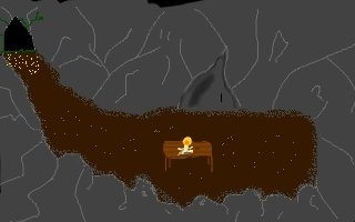
Wait, I'm not exactly sure what you're saying. Could you maybe do a quick mockup?
-
xKiv
- Peasant Status
- Posts: 23
- Joined: Sat Jun 21, 2008 9:35 pm
- Location: Prague
#9
Post
by xKiv » Tue Jul 08, 2008 11:12 am
Here, have this:

I highlighted the cave entry and put a stick monster and a stick man-leaning-on-cave-wall inside.
-
CaptainM
- Peasant Status
- Posts: 27
- Joined: Fri Jul 04, 2008 5:56 pm
#10
Post
by CaptainM » Tue Jul 08, 2008 5:17 pm
Oh I see! Yes that does make it make much more sense. I will try to fix this. I'll post it when I'm done.
-
Blackthorne519
- Royal Vizier Status
- Posts: 2301
- Joined: Mon Sep 08, 2003 3:37 am
- Location: Central New York
-
Contact:
#11
Post
by Blackthorne519 » Wed Jul 09, 2008 9:20 am
I'm not much of an artist, but here's some ideas for you.

Putting objects in the extreme foreground, like the tree, help. Keeping the foreground colors dark gives the feel of perspective. Made the side shrubs "slant". Added a rock for variety and depth.
Bt
-
Gronagor
- Saurus Salesman
- Posts: 3881
- Joined: Tue Sep 03, 2002 3:18 pm
- Location: South Africa (Bloemfontein)
#12
Post
by Gronagor » Wed Jul 09, 2008 12:44 pm
Decide from which side the light will be coming. Go through all the objects and make it darker one side and lighter on the other.
But don't overdo it! In fact, make a duplicate layer/image and work on that... you may want to merge them if the lighting is too much.
Edit: Use PNG files, not JPG! JPG bad! Don't!
-
CaptainM
- Peasant Status
- Posts: 27
- Joined: Fri Jul 04, 2008 5:56 pm
#13
Post
by CaptainM » Wed Jul 09, 2008 5:45 pm
Thanks for all the tips! I really like the tree and the rock. It makes it so much better.
And as for the lighting, I imagine that this is a dense forest. So there really is no definite source of light. It just kinda glows. You know? And I use gimp so what I normally do save one as .xcf and then when I'm ready to import it I just export it to .jpg. Is that still bad?
-
Gronagor
- Saurus Salesman
- Posts: 3881
- Joined: Tue Sep 03, 2002 3:18 pm
- Location: South Africa (Bloemfontein)
#14
Post
by Gronagor » Wed Jul 09, 2008 6:19 pm
No, that's good... if you're the only one working on the pic. If you want someone else to work on it, then JPG isn't a good idea.
Even though it is dense, there should still be some light... otherwise it will be pitch black.
Edit: No wait! You mean import to AGS or another engin? Don't use JPG!
Last edited by
Gronagor on Wed Jul 09, 2008 7:06 pm, edited 2 times in total.
-
CaptainM
- Peasant Status
- Posts: 27
- Joined: Fri Jul 04, 2008 5:56 pm
#15
Post
by CaptainM » Wed Jul 09, 2008 7:03 pm
Wait why? I've used jpg so far and haven't had any problems. Is there something I don't know?
-
Gronagor
- Saurus Salesman
- Posts: 3881
- Joined: Tue Sep 03, 2002 3:18 pm
- Location: South Africa (Bloemfontein)
#16
Post
by Gronagor » Wed Jul 09, 2008 7:09 pm
Ok. Just a quick edit to show you... use the lighting. Blueish and darkness will give the effect of denseness. In art, lighting is all important. It gives the shape and depth. It gives life to the picture.

As for JPG, it compresses the art and messes it up seriously. Especially with low-res pics. Zoom in a little bit and you'll see what JPG does.

-
CaptainM
- Peasant Status
- Posts: 27
- Joined: Fri Jul 04, 2008 5:56 pm
#17
Post
by CaptainM » Wed Jul 09, 2008 7:14 pm
Woah!

That looks so amazingly good! Thank you so much! What program do you use? Could you maybe just give me some pointers with actually using the program? What kind of schooling do you have? I just want to know! Thank you so much! Can I just use this in my actual game?
-
Gronagor
- Saurus Salesman
- Posts: 3881
- Joined: Tue Sep 03, 2002 3:18 pm
- Location: South Africa (Bloemfontein)
#18
Post
by Gronagor » Wed Jul 09, 2008 7:26 pm
Heh. That's nothing.
That's just phase 2 (yours was phase 1... the original planning)
Phase 3 would be defining the shapes etc etc.
As for schooling... just being in the adventure game community for a few years. You'll get it right soon enough.
Photoshop is probably the best program to use, which is what I use, but Gimp (which is free) and most other art tools could be just as effective.
Like I explained earlier, just go add slight light on the one side, and slight darkness on the other side. Then add the shadows on the ground accordingly still using the darkening tools. Try and make the shapes' edges less blurry, and there you have it.
You can do with that pic whatever you want. It is yours anyways.
-
CaptainM
- Peasant Status
- Posts: 27
- Joined: Fri Jul 04, 2008 5:56 pm
#19
Post
by CaptainM » Wed Jul 09, 2008 7:34 pm
But I mean for the lighting do you just like use a paint tool and turn the opacity down? Maybe I just need to read some gimp/photoshop tutorials. But thanks, really thanks a ton. You don't even know how happy that makes me.
As for the png instead of jpg, I tried importing it into my game and it tried to tell me that it was a different size. So I opened it in gimp and it was just 320x200, same size as my other one. So I just hit okay, and it had some huge black space at the bottom. It would mess up my game and the top would get cut off. So I converted it to jpg and it worked fine. Why is this?
-
Gronagor
- Saurus Salesman
- Posts: 3881
- Joined: Tue Sep 03, 2002 3:18 pm
- Location: South Africa (Bloemfontein)
#20
Post
by Gronagor » Wed Jul 09, 2008 7:38 pm
No idea. One of the scripter/programmers will need to tell us about that.
All art programs have a Darkening and Lightening tool. In Photoshop they call it Burn and Dodge. Can't remember what they call it in Gimp. Haven't used it for a few years.
-
CaptainM
- Peasant Status
- Posts: 27
- Joined: Fri Jul 04, 2008 5:56 pm
#21
Post
by CaptainM » Wed Jul 09, 2008 7:46 pm
Yeah it's called burn and dodge. I guess my next step is just learn gimp better. But thanks a ton for all your help. I have a rough sketch of the second screen done, so I'll see what I can do with that!
-
Gronagor
- Saurus Salesman
- Posts: 3881
- Joined: Tue Sep 03, 2002 3:18 pm
- Location: South Africa (Bloemfontein)
#22
Post
by Gronagor » Wed Jul 09, 2008 7:51 pm
Post your next attempt again. That's the only way to learn...
-
CaptainM
- Peasant Status
- Posts: 27
- Joined: Fri Jul 04, 2008 5:56 pm
#24
Post
by CaptainM » Wed Jul 09, 2008 11:40 pm
Ok here is what I have for my second screen so far:
The perspective on this one is messed up too. I'm not sure what needs to be done to fix it. I'd like to add some reflections off the walls from the candle and the entrance (the two sources of light). Again, thanks in advance for any help.
-
Gronagor
- Saurus Salesman
- Posts: 3881
- Joined: Tue Sep 03, 2002 3:18 pm
- Location: South Africa (Bloemfontein)
#25
Post
by Gronagor » Thu Jul 10, 2008 7:39 am
Oooh! You really like making it tough for yourself.
Perspective looks fine... you may want to make the 'border' where the floor meets the wall on the right side either a bit more round or more at an angle. It looks weird to have it as a vertical line like that.
Decide which light source will be the stronger.
I'd say (especially in the round room area) the candle will be stronger. In other words, use a slight yellowish brush to make the lighter areas... Each rock's light will be different since you have to do it on the area facing the candle. Make the rest darker, but not too dark.
As for the secondary light, use a slight blue colour (on everything left from the candle) and give a slight blueish light effect on the sides facing the exit.
Heh. I hope you understand.
Although this screen isn't affected that much by the light from the candle, you can use this to see the slight-blue light effect I'm talking about.
http://i20.photobucket.com/albums/b241/ ... 4game6.png
