This is a public forum, where you can find out everything you wanted to know about making games. Please don't use this forum as a place to recruit new members.
Moderators: adeyke, VampD3, eriqchang, Angelus3K
-
Blackthorne519
- Royal Vizier Status
- Posts: 2302
- Joined: Mon Sep 08, 2003 3:37 am
- Location: Central New York
-
Contact:
#26
Post
by Blackthorne519 » Thu Jul 10, 2008 2:20 pm
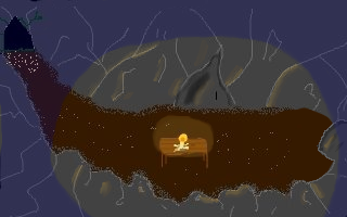
Here's a quick screen I made up as a take on your concept.

This version is a bit brighter, without some many dark lighting effects.

You'll see I tweaked the perspective a bit, while still keeping the feeling of the room.
Bt
-
CaptainM
- Peasant Status
- Posts: 27
- Joined: Fri Jul 04, 2008 5:56 pm
#27
Post
by CaptainM » Thu Jul 10, 2008 5:46 pm
Ok I tried what you said, but it still looks like crap. Maybe even more crap. I just can't do the fine details. What tool do you use to do the fine details? Like the bushes, I love your bushes. Is it just a paint tool or what? Anyways here is my attempt:

As you can see it sucks. I tried to do the blue tint thing. I don't know how it turned out. And I just can't seem to get the lighting off the walls working yet. I did somewhat make the right edge less straight, and attempted to add a rock.
EDIT: Oh blackthorne you beat me to it. I really like what you did, changing the perspective around.Was that an airbrush tool? Sorry I don't know what they're called in Photoshop. But that is very nice. I think I'll go with your screen and work off that. Let me see what I can do as far as adding details.
-
CaptainM
- Peasant Status
- Posts: 27
- Joined: Fri Jul 04, 2008 5:56 pm
#28
Post
by CaptainM » Thu Jul 10, 2008 6:27 pm
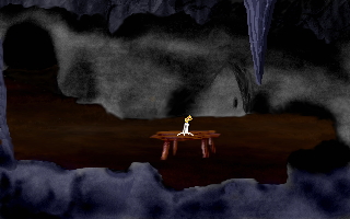
OK here is what I did:

I added the stalactite (the icecickle thing). I like that a lot. I think it might be good enough to just leave. I added my "secret door" behind the table. Sorry, I think I forgot to mention it. I made the door a little different. Before it kinda seemed like you were entering from almost the right side and curling around. I just put more dirt up there. Does that make sense? Anyways. And I just added a little color to some of the black spots in the foreground. They almost looked like small, cancerous spots or something. So tell me what you think! I got my iconbar done, but I'm not sure about it. I'll post it too.
EDIT:
Here is my icon bar. I don't know if I like just the text instead of actual icons. I've found that while I'm playing I pause for a second to read the icons. It's just that I suck at drawing. But how about the color scheme?

-
CaptainM
- Peasant Status
- Posts: 27
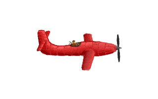
- Joined: Fri Jul 04, 2008 5:56 pm
#29
Post
by CaptainM » Thu Jul 10, 2008 10:56 pm
Ok, the more I looked at my gui, the more I hated it. So I decided to draw actual icons instead of just words. I'm stuck on the the hand. I got a picture of a hand and just traced it but by the time I scaled it down to the icon size it just looked like a blurred mess. Is there any way around this?
-
Gronagor
- Saurus Salesman
- Posts: 3881
- Joined: Tue Sep 03, 2002 3:18 pm
- Location: South Africa (Bloemfontein)
#30
Post
by Gronagor » Fri Jul 11, 2008 7:57 am
Just having some fun. I have no idea whether this will work:


-
KQartist
- The Art-inator
- Posts: 713
- Joined: Tue Jan 27, 2004 11:05 am
-
Contact:
#31
Post
by KQartist » Fri Jul 11, 2008 10:45 am
Hey CaptainM, nice work on these backgrounds. In the end nothing beats lots of practice, and with time, you'll look back and notice how much you've improved. When coloring from scratch, it's always best to make your sketch as detailed as you want it to be before coloring. Also, try to layer your images starting from the background, and working your way in to the foreground. You'll more effectively create depth when you layer this way, as coloring over a flattened image makes it more difficult to separate elements of the scene.
To answer your question about resizing to avoid blurriness, make sure you resize using
nearest neighbor rather than bilinear or bicubic. This will size your image using solid pixels without anti-aliasing, giving the image a sharper appearance. You would also resize sprites the same way, to keep all of the solid pixels in place.
Keep up the good work!

-
CaptainM
- Peasant Status
- Posts: 27
- Joined: Fri Jul 04, 2008 5:56 pm
#32
Post
by CaptainM » Fri Jul 11, 2008 6:59 pm
Ok, here is the new icon bar:

I like it MUCH better. But about the nearest neighbor, is that in gimp? There are settings for scale under the interplation menu which are: None, Linear, Cubic, and Sinc. Would that be one of these?
I think the next step I want to do is get my opening cutscene done. I need to draw an airplane for that, so I'll see what I can do. As far as the coding goes, I'm proud to say that I have a pretty easy time with it. I have like a year or two of c++/java/whatever else. But that's enough bragging

Anyway, thanks a lot and I'll post my airplane when I get it done.
Oh and, note to the mods: Could maybe this thread's name be changed to something like "Help with my game"?
-
CaptainM
- Peasant Status
- Posts: 27
- Joined: Fri Jul 04, 2008 5:56 pm
#33
Post
by CaptainM » Fri Jul 11, 2008 9:35 pm
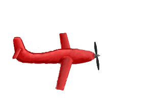
Ok, rough draft of airplane done:

For the most part, I'm pretty pleased with this. I'm going to add an open cockpit, and some yellow stripes as well as maybe some sort of number on the side. And maybe little things like showing the individual sheets of metal and their corresponding bolts. But just as far as perspective and whatnot, how does it look?
-
xKiv
- Peasant Status
- Posts: 23
- Joined: Sat Jun 21, 2008 9:35 pm
- Location: Prague
#34
Post
by xKiv » Fri Jul 11, 2008 10:20 pm
The left wing looks like it slants upward, while the right wing looks like it slants downward.
Also, the tail seems to be missing the left wing-thingy entirely. It should be obscured, but only mostly.
-
CaptainM
- Peasant Status
- Posts: 27
- Joined: Fri Jul 04, 2008 5:56 pm
#35
Post
by CaptainM » Fri Jul 11, 2008 10:31 pm
So how would you recommend I fix it?
-
Music Head
- Defense Minister Status
- Posts: 717
- Joined: Sun Aug 15, 2004 3:55 am
- Location: South Australia
#36
Post
by Music Head » Sat Jul 12, 2008 5:08 am
You could try Google searching for pictures of flying airplanes, and see exactly how their wings look. It's always a good idea to research how things look before trying to draw them; rather then try and draw from pictures in your head. Also your art looks pretty promising to me, and I'm sure after practicing for a while it'd look great

. Best of luck.
Last edited by
Music Head on Sat Jul 12, 2008 5:19 am, edited 1 time in total.
-
CaptainM
- Peasant Status
- Posts: 27
- Joined: Fri Jul 04, 2008 5:56 pm
#37
Post
by CaptainM » Sat Jul 12, 2008 5:10 am
Uhhh that's what I did

But no worries. I think I'll take another ganter at it just about right now...
-
Gronagor
- Saurus Salesman
- Posts: 3881
- Joined: Tue Sep 03, 2002 3:18 pm
- Location: South Africa (Bloemfontein)
#38
Post
by Gronagor » Sat Jul 12, 2008 10:22 am
I think if you have just a slight 'peek' of the left tail wing the strange effect MH mentioned would be gone... and the cockpit would fix it even more.
-
CaptainM
- Peasant Status
- Posts: 27
- Joined: Fri Jul 04, 2008 5:56 pm
#39
Post
by CaptainM » Sat Jul 12, 2008 7:59 pm
Hmmm. Well I'm trying to fix this. I just can't seem to get the wings down. It seems like the two wings are coming from two different points of view. Kinda like that one cube thing where if you look at it one way or the other it looks different. Like an optical illusion? Anyway, I like the view of the right wing better, so how can I fix the left wing to match the right? Does it need to be shorter? Longer? Slant at a different angle? Or is it the shading?
EDIT: Here is what I'm looking at:

I shortened the wings and added the left back wing. Is this better? If you look from the tail to the front, it seems the plane is twisting. Does anybody else see this?
-
xKiv
- Peasant Status
- Posts: 23
- Joined: Sat Jun 21, 2008 9:35 pm
- Location: Prague
#40
Post
by xKiv » Sat Jul 12, 2008 8:50 pm
CaptainM wrote:I shortened the wings and added the left back wing. Is this better?
Yes, somewhat.
If you look from the tail to the front, it seems the plane is twisting. Does anybody else see this?
That's (almost) exactly what I was talking about earlier.
Try drawing "helper" parallel lines through the different pairs of wings. (the back wings look good, so do one through them, a parallel one through where the front wings should meet inside the plane's body, then fiddle with the front wings until you FEEL they have the correct (and equal) angles).
Or drawing it "from above", then applying the perspective tool (this probably won't end well).
-
PotatoSlayer
- Knight Status
- Posts: 220
- Joined: Wed Jan 12, 2005 1:40 am
- Location: Jax Beach, Florida
-
Contact:
#41
Post
by PotatoSlayer » Mon Jul 14, 2008 12:31 am
If you're looking at a picture of a plane and trying to recreate it I would suggest turning the picture upside down. you could also cover up part of the image with a piece of paper and draw one little portion and when you get that down move to the next part, just concentrate on the lines in the picture. Back in high school i had to take a drawing class and these were some of the tricks my teacher gave me cause i suck at drawing. I did a pretty gnarly sea turtle. ur drawing skills seem a lot better than mine tho so these methods might not work for you.
-
CaptainM
- Peasant Status
- Posts: 27
- Joined: Fri Jul 04, 2008 5:56 pm
#42
Post
by CaptainM » Mon Jul 14, 2008 4:33 am
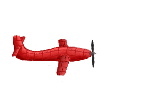
I think this looks much better (as far as the perspective is concerned):

How do the metal plate line things and the bolts look? I really like the ones on the wings. The body... not so much. But tell me what you think.
-
xKiv
- Peasant Status
- Posts: 23
- Joined: Sat Jun 21, 2008 9:35 pm
- Location: Prague
#43
Post
by xKiv » Mon Jul 14, 2008 11:51 am
The whole tail part still looks weird ("pull" the far end of the back wing somewhat left and down (image-wise directions)) and the near end to compensate) and slightly too big, but it is already getting much better.
Plates look good. I don't see any bolts, so good too, I assume (they are unobtrusive, which is way better than obtrusive).
-
CaptainM
- Peasant Status
- Posts: 27
- Joined: Fri Jul 04, 2008 5:56 pm
#44
Post
by CaptainM » Tue Oct 07, 2008 4:43 am
I bet you guys thought I gave up.

Well, I did for a while, but now I'm working again. I just thought I'd post my progress on the airplane. I like it, with the cockpit and all. I think it's pretty much good. I'm also working another screen of background, and so far it's coming along really well. I'm going to school now so I can use their tablets, and that makes it about a million times easier. So let me know what you think!
Well, actually, I can't seem to get photobucket to work right now. I'll upload it tomorrow.
-
CaptainM
- Peasant Status
- Posts: 27
- Joined: Fri Jul 04, 2008 5:56 pm
#45
Post
by CaptainM » Tue Oct 07, 2008 7:37 pm
Here it is:

-
1234567890
- Knight Status
- Posts: 213
- Joined: Tue Oct 14, 2008 12:11 pm
#46
Post
by 1234567890 » Sun Oct 19, 2008 11:58 am
I am no expert, but I like that new plane a lot!
Where will it be used in the game?
-
CaptainM
- Peasant Status
- Posts: 27
- Joined: Fri Jul 04, 2008 5:56 pm
#47
Post
by CaptainM » Sun Oct 19, 2008 8:51 pm
In the opening cutscene. Now all I need to do is figure out the scripting side of things, but that shouldn't be too hard.
-
CaptainM
- Peasant Status
- Posts: 27
- Joined: Fri Jul 04, 2008 5:56 pm
#48
Post
by CaptainM » Fri Dec 12, 2008 5:15 pm
Ok so I've been hard at work on the next scene. It's after you go through the "hidden" door. As you can see, It's a waterfall. I'm going to have the character ride a log out of there, and then fall down a big waterfall down the side of the cliff. But for now, tell me what you think of the scene. Of course, there are little white spaces that I haven't filled in yet, but try to look past those. I really want to make this Sierra quality, so tell me everything.

Edit: Curse you picasa web albums! I can never get them to work! So I used photobucket, but it's WAY too small. Guess this will have to do for now.


