Page 9 of 20
Posted: Sat Dec 18, 2004 10:04 am
by JWar
http://84.35.65.126/~jwar/sq2/
If people could send me the missing information about the screens, that'd be greatly appreciated. With info I mean the last update date and who did it.
Posted: Sat Dec 18, 2004 10:33 am
by Alias
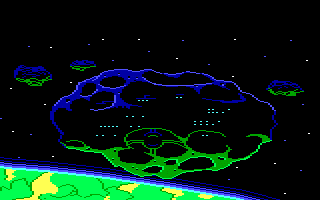
Posted: Sun Dec 19, 2004 4:10 pm
by moonlit
Hi,
Updated the following pic (new tree top, grass and updated foreground).

Scaled down version:

Regards, Rono AF Greve
Posted: Sun Dec 19, 2004 4:28 pm
by Khaveen
I don't know why, but the sky looks a little flat. Maybe because it has only one background layer and it should be darker in the bottom. (check out your swamp picture for a good example on background layers) The lighting is rather weird, are bushes glowing or what?

And you've chosen a too contrasted color pallette for the dirt. Except that, it looks great, my thumbs up.
Posted: Sun Dec 19, 2004 4:50 pm
by Alias
Well I love it, the sky could just use a cloud. :D
Posted: Sun Dec 19, 2004 4:54 pm
by Khaveen
Oh and Rog, here is the gif I promised you:
Posted: Sun Dec 19, 2004 7:40 pm
by moonlit
Hi,
Khaveen:
I like my pictures with a lot of contrast, but wel it probably depends on ones taste, I find most other pictures a bit flat.
Skies are usually lighter at the horizon (at least here in the netherlands ;) ). But I guess you mean the tree layer?
The tree layer could indeed use a companion

When I first painted this picture I tried to stay more true to the original, however I think I have to deviate a bit more of that. What might look good in "agi" graphics, just doesn't always seem right in VGA style. I'm going to first update the old pictures and then add an extra layer.
Rog:
Well I contemplated for a cloud for sometime. Usually I add one. But this picture just gave me the feeling of a very hot day. So in the end I decided to not add a cloud.
Thanks for everyone's comments (keep'm coming
).
Regards, Ron AF Greve.
Posted: Sun Dec 19, 2004 7:43 pm
by Alias
I love the bright colours. :D
Posted: Sun Dec 19, 2004 7:49 pm
by Khaveen
I like my pictures with a lot of contrast, but wel it probably depends on ones taste, I find most other pictures a bit flat.
Skies are usually lighter at the horizon (at least here in the netherlands Wink ). But I guess you mean the tree layer?
The tree layer could indeed use a companion Smile When I first painted this picture I tried to stay more true to the original, however I think I have to deviate a bit more of that. What might look good in "agi" graphics, just doesn't always seem right in VGA style. I'm going to first update the old pictures and then add an extra layer.
Yep, I meant the tree layer.
And the contrast just doesn't fit in the classic Sierra painted pics feeling. Check out Conquests of Longbow (a game with a lot of trees, grass and ground).
Posted: Sun Dec 19, 2004 10:48 pm
by moonlit
Hi,
Thanks Rog :)
Well I think if the original creators weren't limited by technology (resolution and colors) at the time the graphics certainly would have looked even better. Even so, if don't think sierra's pictures were as flat as most in this thread. Take for instance this picture from kq5:

Maybe also a problem is that we are talking about sierra graphics while there really isn't such a thing. For instance the graphics in kq4 to kq8 (yes even KQ5 is different from KQ6) are all very different. And the same is true for the space quest series. SQ3 is very different from SQ4 and SQ4 very different from SQ5 not too mention SQ6 of course.
But I assume we mean something like KQ5/KQ6/QFG4/SQ4.
Well anyway I am going to update the old graphics of mine. I am not sure if I am going to do any new ones. Creating outdated graphics just doesn't make much sense to me.
However, sure learned a lot by imitating the sierra graphics. Hope one day all these backgrounds will be done (and someone will make a better looking game than the old SQ2 (outdated or not ;-) ).
Great idea BT.
Regards, Ron AF Greve.
Posted: Sun Dec 19, 2004 11:11 pm
by Alias
One Im working on:

Posted: Sun Dec 19, 2004 11:31 pm
by moonlit
Hi Rog,
Good start, however looking at your picture I might be wrong but it seems that you are painting in one layer instead of different ones
If so ...
you might try to separate the picture in three layers to start with this will make it easier to paint (you then don't have to be afraid to paint over other areas).
For instance the front right side should go in the top layer the left side in the middle layer and the right side in the bottom layer then you could make a selection of the area you want to paint in that layer and don't have to worry that you paint over other areas.
Just an idea.
Regards, Ron AF Greve.
Posted: Sun Dec 19, 2004 11:34 pm
by JLM5
Here is my first attempt to combine the style of Moonlit and the style of myself (and Bt). I made (quite radical) paintover from one of the Moonlit's backgrounds. Of course, if Moonlit feels I have destroyed his picture (or something like that) we will not use this paintover in the final SQ2VGA.

Posted: Sun Dec 19, 2004 11:41 pm
by moonlit
Hi JML,
Well it sure is a paintover I only recognize some leaves and the black foreground :lol
Anyway of course you can change or create them new (what is actually more what you did I think
.
But, looks very good.
Keep up the good work.
Regards, Ron AF Greve.
Posted: Mon Dec 20, 2004 12:13 am
by Khaveen
JLM5 wrote:Here is my first attempt to combine the style of Moonlit and the style of myself (and Bt). I made (quite radical) paintover from one of the Moonlit's backgrounds. Of course, if Moonlit feels I have destroyed his picture (or something like that) we will not use this paintover in the final SQ2VGA.
I like your style, truly Sierra-like. But it looks to Earth-like. Add some exotic things, it's a jungle, not a Sherwood forest! ;)
Posted: Mon Dec 20, 2004 8:28 am
by Alias
moonlit> I know. I just wanted to post the in progress image. ;)
Posted: Mon Dec 20, 2004 12:15 pm
by JLM5
Here is yet another "Sierra-stylized" paintover from one of the Moonlit's backgrounds. By the way, do you want I continue this work - the making of paintovers to standardize our styles?

Posted: Mon Dec 20, 2004 2:56 pm
by Alias
I love the textures you use. Cool. :\
Posted: Mon Dec 20, 2004 9:27 pm
by Blackthorne519
JLM
Yes, I think you've taken Moonlit's backgrounds, and adapted them to a similar style - which is great! This is what this thread is about, working together to make pictures, and I like what you've done.
Bt
Posted: Mon Dec 20, 2004 10:21 pm
by JLM5
Thanks.
Remember, Moonlit: You can tell me anytime if you feel I'm "destroying" your good-looking pictures.
However, here is the next one:

Posted: Mon Dec 20, 2004 10:24 pm
by Khaveen
JLM5 wrote:Thanks.
Remember, Moonlit: You can tell me anytime if you feel I'm "destroying" your good-looking pictures.
However, here is the next one:
It's perfect, except I thought that you would change the awkward lighting of the trees.
Posted: Mon Dec 20, 2004 10:33 pm
by Alias
Thats way too dark.
Posted: Mon Dec 20, 2004 10:40 pm
by JLM5
Khaveen wrote:It's perfect, except I thought that you would change the awkward lighting of the trees.
How it should be changed?
By the way, here is a new, updated (especially sharpened) version from one of my older pictures:

Posted: Tue Dec 21, 2004 9:23 am
by JWar
Rog wrote:Thats way too dark.
Rog, seeing that this is a creative thread, try to be a little less blunt in your critique will you?
Posted: Tue Dec 21, 2004 9:44 am
by Alias
JLM5 wrote:Thanks.
Remember, Moonlit: You can tell me anytime if you feel I'm "destroying" your good-looking pictures.
However, here is the next one:
Most of JLM5's backgrounds are just a little bit darker than everyone elses. Paint over:
